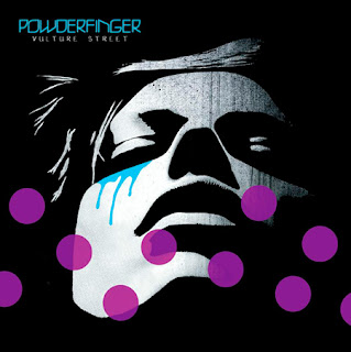
 The image on the right is the original CD cover for 'Powder Finger'. Our task was to recreate the CD cover by using the programme 'Adobe Photoshop'. The first thing we had to do was to choose an image that was similar to the original image on the poster. The image that I decided to use was of Angelina Jolie which can be seen below.
 Once I had dragged the image into photoshop, I cropped it so that only Angelina's head could be visible. I then clicked on adjustments to make the image black and white, just like the original CD cover. Next I used the posterize tool in order to decrease the contrast in the image. I then inserted a new layer of an image of dripping blood and then rasterized the image to enable me to edit it. Once I had done this I used the magic wand tool in order to take the white background out of the image so that all I was left with was the dripping blood.
Whilst using the colour balance option in adjustments, I was then able to change the colour of the dripping image to blue so that it would resemble tears rather than blood. I did this by applying the colours cyan and blue 8 times in order to create the correct shade of blue that I wanted on my CD cover. I then placed the dripping image underneath her eye and used the eraser tool in order to shape it so that it curved under her eye. I then used the text tool and chose a light blue colour in order to write the title of the album 'Powderfinger' in bold letters across the top of the image, replicating the original CD poster. Lastly, I added 10 small circles in the colour Magenta whilst using the ellipse tool. I then changed the opacity to 70% to make the circles seem more translucent. Furthermore, I duplicated the circles 10 times and scattered them around the image to replicate the original CD cover.
The image above is my final CD poster. I feel that I was successful in recreating the Powder Finger CD cover as I included all the necessary elements in order to replicate the original CD cover.

No comments:
Post a Comment