Designing a logo for our artist
In order to promote our artist through his products, we had to create a logo that would represent his synthetic mainstream star image. We designed the variations of our artists logo by using the editing programme Photoshop.
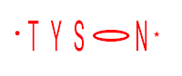 When designing the logo we wanted to create something that was simple yet effective, but that would not over power Tyson as an artist. Therefore we decided to use Tyson's name as a basis for his logo and added a few small touches to make it more eye catching to his audience. We created two different variations of the logo, the first which was red, and the second which was black. We decided to go for the black variation as we thought the red didn't stand out on our artist's digipak as it blended into the background too much. We also thought that the black variation looked much more professional than the red variation and therefore fitted in more with the star image of our artist.
 When designing the logo we wanted to create something that was simple yet effective, but that would not over power Tyson as an artist. Therefore we decided to use Tyson's name as a basis for his logo and added a few small touches to make it more eye catching to his audience. We created two different variations of the logo, the first which was red, and the second which was black. We decided to go for the black variation as we thought the red didn't stand out on our artist's digipak as it blended into the background too much. We also thought that the black variation looked much more professional than the red variation and therefore fitted in more with the star image of our artist.
No comments:
Post a Comment