Audience feedback on our music video
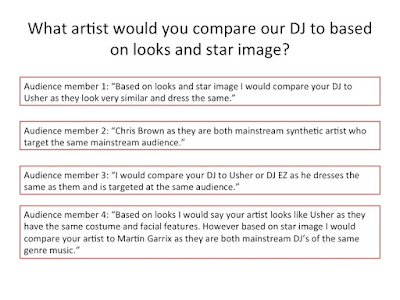
The feedback we received from our target audience about our music video was mainly positive, as our audience really liked our 1980's colour scheme and filter that we used as it made our music video more eye catching. Our audience also enjoyed the narrative of our music video as they thought it was creative and very original. They also commented on the DJ in our music video, stating how his star image of a synthetic pop/dance artist was clearly demonstrated through the close ups we used in our video.
However we also received a few criticisms of our music video. Some people thought that we had not included enough shots of our artist and that we had focused more on the narrative than the performance of our music video. Other members of our audience also thought that we could improve on the lighting in our music video as it was a bit too dark in some of the shots of the DJ. We were also told by several members of our audience that our shots were too repetitive and that it gave the impression that we had run out of footage and that we were dragging it out in order to increase the length of our music video.
Overall the feedback we received was very constructive and would therefore help us meet the expectations of our target audience in order to sell our product to them.
Audience feedback on our digipak
Audience feedback on our digipak
The feedback we received from our target audience regarding our digipak was mainly positive, as our audience commented on how they liked the colour contrast of the red and black as they thought it stood out and that the design highlighted the pop/ dance genre of our artist's music, which was what we intended. They also commented on the picture of our artist from the inside cover, and how they thought this picture really illustrated the synthetic nature of our artist and emphasised his DJ status. Our audience also thought that we demonstrated continuity throughout our digipak by using the same colours.
However, we received one criticism of our digipak which was that the writing on the front cover was not directly in the centre of the cover, which our audience found annoying to look at.
Overall we are very happy with the feedback we received on our digipak as it demonstrates how we have successfully created a product that appeals to our target audience and illustrates the synthetic star image of our artist.
Audience feedback on our website
Audience feedback on our website
The feedback we received from our target audience regarding our website was mainly positive, as our audience found our website easy to use as the bookmarks at the top of the page made it easy to navigate in order to find the information our audience were looking for. Our audience also liked the colour scheme and layout of our website, as they thought the bright colours helped to highlight the pop/ dance genre of our artist. They also stated how they found that our website was very informative as it included all the information our audience were looking for.
However, we did receive one criticism about our website, which was that our website doesn't include a link to our music video. Our audience felt that if we included this then it would help the audience see who the artist is that we are trying to sell.
Overall we felt that the audience feedback we were given about our website was mainly positive, and that we had successfully matched the design and layout of our website to the genre of our artist, therefore illustrating his star image.
Feedback from our survey monkey questionnaire
Focus group feedback on our music video
Feedback from our survey monkey questionnaire
The constructive feedback that we received from our survey monkey questionnaire enabled us to gain an insight into what our target audience liked and disliked about our music video and what their opinions were of our artist's star image. This feedback also enabled us to make changes to our music video in order to appeal more to our audience.


No comments:
Post a Comment